Thursday, August 11, 2011

Day & Night

Greetings my dearest ones.

I have found another way to transform day into night and because I love you all so much, I am sharing it with you.  Do you feel the love?  ;)


I’m really excited about this method because … it’s EASY!  YAYYYY!

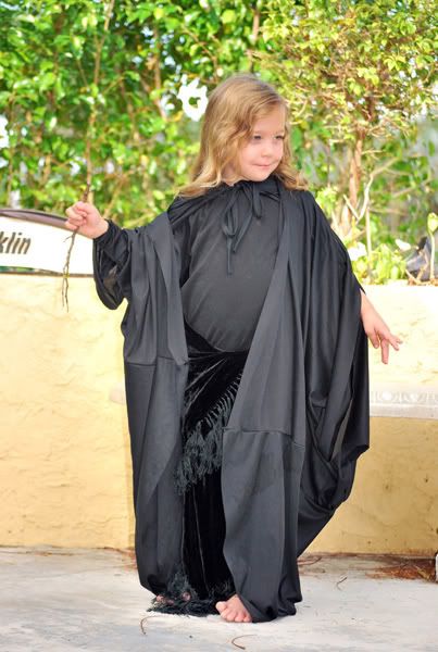
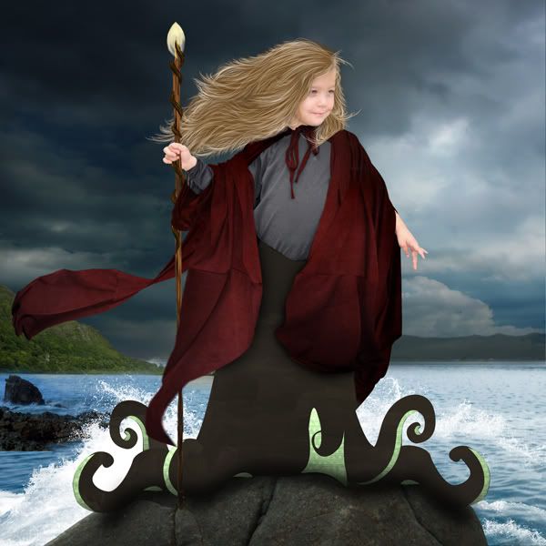
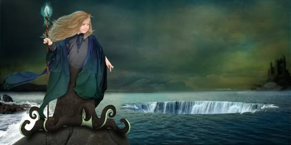
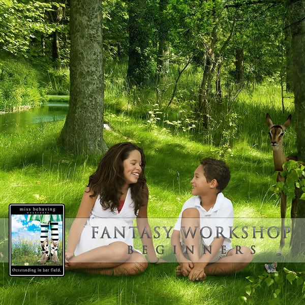
I am taking this photo:
Everyday Magic by Miss Behaving

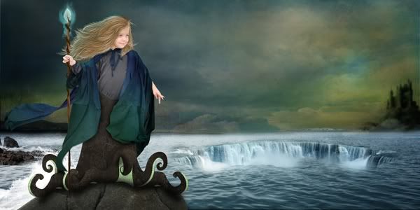
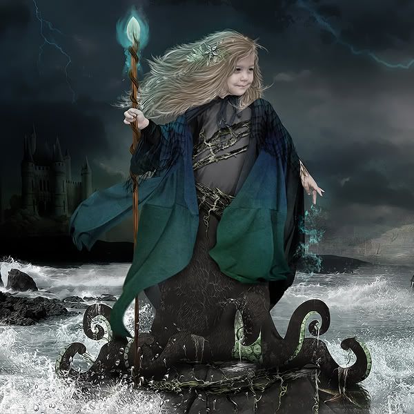
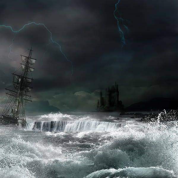
And changing it into this:

Evening Magic by Miss Behaving

Let’s get started with our original layout image.  Duplicate your image by hitting “CTRL + J”.

Duplicate Original

Next Desaturate it.  Hold down “CTRL + U” to bring up the Hue/Saturation options.  Slide the Saturation level to -100.

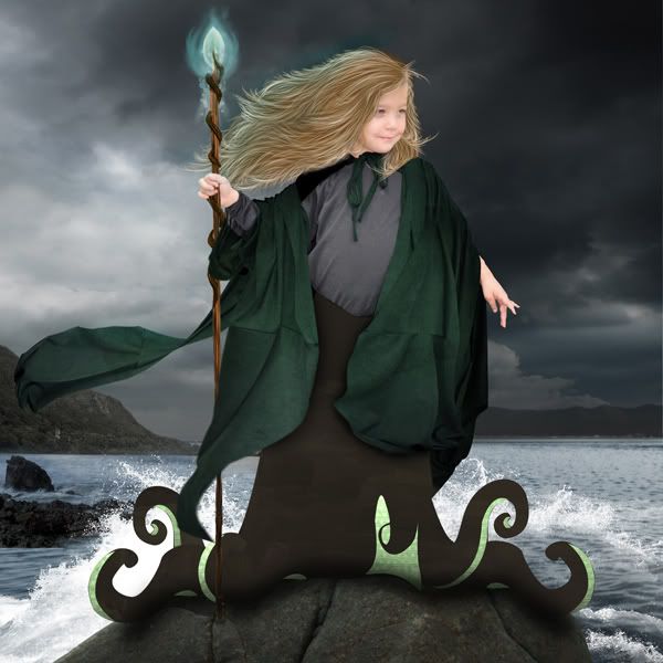
Hue/Saturation @ -100

Duplicate your Desaturated Layer by holding down “CTRL + J”.

Duplicate Desaturated Layer

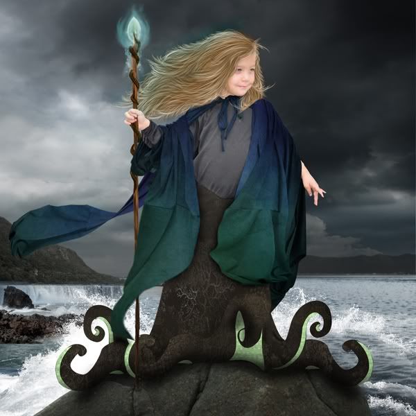
Now we are going to adjust the color to make it more of a night-time blue color.  Hold down “CTRL + B” to bring up the Color Balance options.  Use the sliders to adjust the color balance.  The settings I have below work really well for this piece.  You may have to adjust them on your own but I have to admit, usually the -55 setting on the Cyan color really works well for me on almost everything.

Color Balance Settings

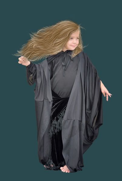
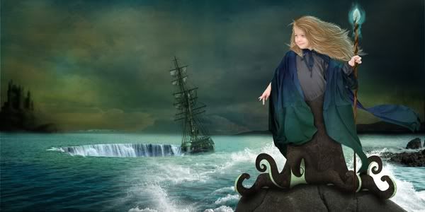
Now this is starting to look like night time!

Cyan and Blue Color Balance

If you were to stop right here, you would definitely be doing alright.  However, as most of you know … I like to really make things “POP”!

To make it darker, I duplicated the blue layer and set the Blending to Mode to “Multiply”; then adjust the Opacity to 70% and the Fill to 50%.  Again, depending on how dark your shadows and original piece is, these settings may vary.  There is no “set” way to make it work perfectly the same way every single time.  Adjustments to blending modes, opacities and fills are crucial.

Blending Mode - Opacity - Fill Settings

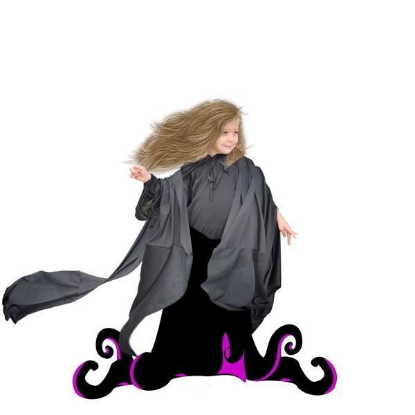
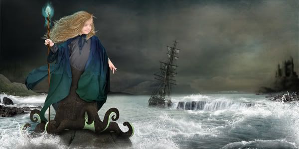
You have now successfully changed day into night!  Do you feel the POWER?!   Mwuahahaha!!
Night Time

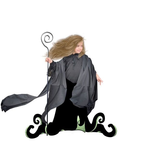
The last thing I did was add some highlights and more shadows by painting them on.  That’s another lesson for another time.   I hear there is an awesome Fantasy Workshop starting up September 1st!   ;)  

Evening Magic by Miss Behaving


Let’s give a great big hand and a hearty “THANK YOU” to Lorie Davison who provided all of this lovely and gorgeous product.  This episode was brought to you by “Artist’s Faeries”.

Artist Faeries by Lorie Davison
Artist's Faeries by Lorie Davison

I hope you’ve enjoyed this Easy Peasy Quickie Lesson.  I LOVE tutorials like this!  :D


Have a great week and Happy Creating.  :)

Sunday, July 31, 2011

Fantasy Style Layout Workshop!

It is finally here.  Woohooo!!


This is the workshop for you if you have ever entertained the thought on how to create a Fantasy style layout and did not know how to get started.

The Fantasy Workshop will give you step-by-step instructions on how to create a photo-manipulated layout and includes materials.

-Difficulty Level: Beginner to Intermediate
-Instructions performed in PhotoShop CS
-10% Discount to Alumni
-Please e-mail MissB for your Alumni Discount Code: fl.cre8tive.n8tive@gmail.com
As a MissBehaving Workshop Member, you will receive the following benefits:
  • A video tutorial with detailed easy-to-follow instructions.
  • Each tutorial will come with a PDF file that will be yours to save.
  • Gain Access to the upcoming Miss Behaving Workshop forum where there will be one-on-one instruction.
  • Class assignments where you will receive Constructive help and tips.
  • Full kit "Pixie's Playground" by Cryztal Rain which includes: 18 papers and 138 elements. (Pixie's Playground Kit will be available once the workshop has begun.)

The following material will be covered:

I. Creating a Concept
2. Extraction Methods
3. How to Blend Backgrounds
4. Layer Masks
5. Color Balance/Variations
6. Hue/Saturation
7. Realistic Shadows
8. Texture
9. Dodge Tool
10. Burn Tool
 

Pre-registrations starts now as class size is limited.

CLASSES START ON SEPTEMBER 1, 2011
 
FREQUENTLY ASKED QUESTIONS

1) What program will the workshop be for?
Adobe Photoshop CS, however, if you are familiar with "translating" instructions into your own software programs, this workshop will help.

2) How long is the class?
Workshop forums will be open for 6 weeks.

3) Is it work at your own pace, or is there an end date?
There is an end date. Approximately six weeks of class. There are weekly assignments that will be given out with a due date if you would like constructive feedback so there will be a time limit on turning in assignments.

4) How many sessions will there be?
There will be 5 sessions. Two chapters per video/PDF file.

Saturday, May 28, 2011

Maelstrom Walk Through

Hello, my friends!  :)

A lot of you have asked about my creative process.  You're in luck!  During the latest piece I did called "Maelstrom" I finally remembered to take screen shots of my progress.  ;)  (Actually, I kept bugging and pestering two good friends, Sandra & Heather for their expert opinions.  LOL)  Thank you for your never - ending patience ladies!

Even if they did lose patience, they were gracious enough not to tell me to go take a L O N G swim out in the gator pond out back.  Heh

This is just an overview ... not a complete tutorial.  Meaning I will not describe how I did step-by-step.  Maybe one day but I just don't have it in me today.  LOL

Step One:  The original photo of Morgan


Step Two:  Extracting Morgan


Step Three:  Painting Hair on Morgan


Step Four:  Paint Tentacles


Step Five:  Create Body to go with Tentacles and Movement to the Cape


Step Six:  Add a Staff & Change Color of Tentacles


Step Seven:  Start Adding Background - Use awesome water brushes from Cryztal Rain -  Change Staff - Change Color of Cape to Red


Step Eight:  Change color of cape to Green - Begin Darkening up the Mood - Add glow to staff using Cryztal Rain's "Bokeh Lightz" brushes & glow to hair


Step Nine:  Add Texture and Shading to the tentacle body


Step Ten:   Change color of the cape ... A G A I N.  Slowly start to question your sanity.


Step Eleven:  Confirm that you've lost all sense of self-preservation because you've decided to make it a Double Page.  Start all over with a new background using Lorie Davison's fabulous art.

Step Twelve:  Clean up the maelstrom and make it darker.


Step Thirteen:  Add the Black Pearl (not really the Black Pearl) from Eena's Creations and flip the page to see if you like seeing it from this perspective. 


Step Fourteen:  Decide you were right the first time and wait 15 minutes for your image to flip back over.  Add some more awesome water brushes from Cryztal Rain.  Add some more land to add the illusion of depth of focus and Darken up the image even more.


Step Fifteen:  Add MORE brushwork with the water for waves and dripping off the tentacles.  Add some spoooooky lightning.  All brushes from Cryztal Rain and even more goodies from the artistic phenomena known as Lorie Davison.  Then go even DARKER!


Step Sixteen:   Did I say go darker ... I meant REALLY go to the DARK Side ... and added some hair accessories.

Step Seventeen:  Decide you may have gone too far with the hair accessories with the help of a good friend (thank you, Sandra).  Spam ... I mean ... e-mail your friend with about 7 different hair styles, until she's tired of you and you're happy and she's ready to add you to her spam filter.  And lighten up the bottom right hand waves.


Close - Ups


Side B:


That's it!  

Done in Photoshop CS5
Total Work Time:  Around 40 hours
Products Used by the following Designers:
Cryztal Rain:  Shop
Lorie Davison:  Shop
Eena's Creations:  Shop


Saturday, March 26, 2011

Setting the Mood

I'm going to share some coloring "secrets" today to help you make a color cohesive layout. So strap your seat belts on, hang on tight and awayyyy we go! Heh

~ DreamCatcher ~
If you are anything like me, you are probably using a variety of kits to create one layout. The major drawback to using various elements in different kits, is that sometimes the colors don’t match up as well as one would like.
No matter how good and sound your design is, if the colors are off, it will look somewhat disjointed and not cohesive.

Pre-Operative Un-Colored
As you can see, the design is sound but it just doesn’t look right. We have blue skies, green shrubbery, neutral grass, red berries … it just doesn’t “match”.
I’m going to show you how to bring it all together so that everything in the layout looks cohesive and like it all belongs together instead of a hodge-podge, mix & match mess.
Once I have everything where I want it and am happy with the design, I first save the image and then duplicate it just in case I don’t like where it’s going, that way I don’t lose all of the hard work. Oy! Once I’m sure it’s safe, I merge all of the layers and flatten the image.
Go to the bottom right hand corner of your work space and click on the “Create a New Fill or Adjustment Layer” button.

Create a New Fill/Adjustment
Choose Black and White

Black & White Adjustment Layer
This will bring up the Black and White dialog box.
I chose the default, “None”.

Default Settings
Change the Blending mode to “Color” and the Fill to 60%.

Color @ 60%
I want to darken it now with some drama. Repeat the B/W steps.
Create a New Fill or Adjustment Layer button.

Create a New Fill/Adjustment
Choose Black & White

Black & White Adjustment Layer
Default “None”.

Default Settings
However, this time … change the Blending Mode to “Overlay” and the Fill to 50%.

“Overlay” and Fill @ 50%
Already, it’s looking much better.

Post B/W Adjustment Layers
Now it’s time to start working on color cohesiveness.
Click on the “Create a New Fill or Adjustment Layer” button.

Create a New Fill/Adjustment
This time, choose the Hue/Saturation option.

Hue/Saturation Option
This will bring up the Hue/Saturation Dialog box. I chose a saturation of -72.

Negativity ... not always bad
I left the settings as is. (Blending Mode “Normal” @ 100%).
Look at the changes already … Muy Dramtico!

ADORO!
I really like the changes so far, but I want to add some dramatic blue night time ambience.
Time for another Adjustment layer.
Click on the “Create a New Fill or Adjustment Layer” button ... A G A I N.

Create a New Fill/Adjustment
This time choose “Solid Color”

Solid Color Adjustment Layer
This will bring up the Color dialog box.
I’ve chosen a the blue color #0592dd

Color #0592dd
I’ve changed the Blending mode to “Color” & lowered the Opacity to 50%.

Color @ 50%
Oooh La La!

J'Adore!
I want to make it just a wee bit darker. So I duplicated the layer by hitting “Ctrl + J” for the PC users. “Cmd” + J” for the Macs.
Then set the Blending Mode to “Multiply” with an Opacity of 20%.

"Multiply" @ 20%
What a difference, huh?!?
ORIGINAL

Pre-Operative Un-Colored
FINAL RESULTS
Happy Creating!